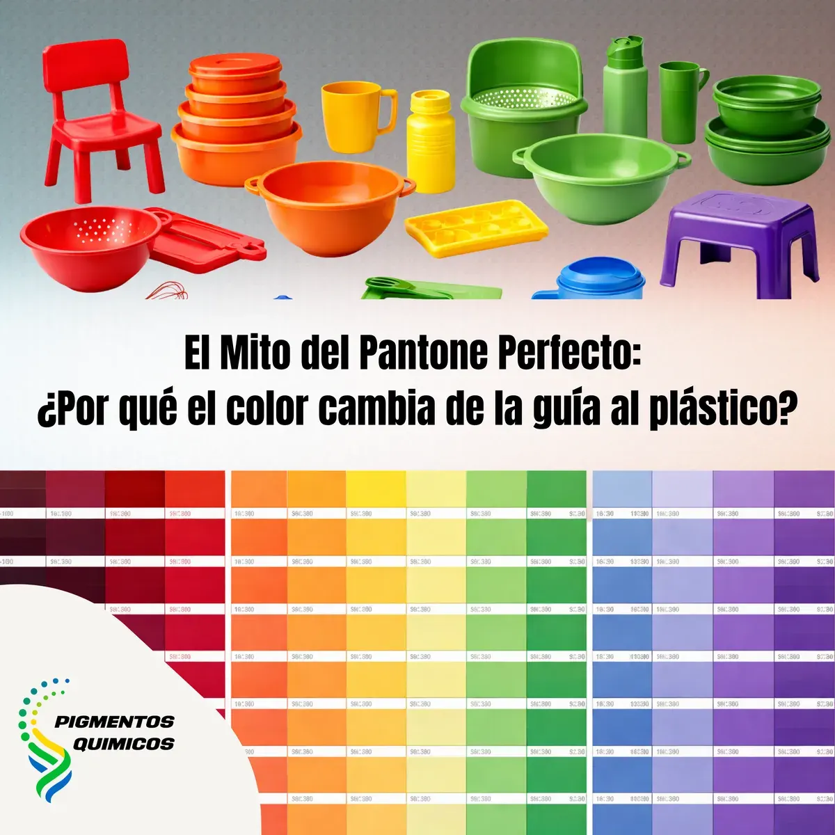
The Perfect Pantone Myth: Why Does Color Change from Guide to Plastic?
For designers and plastics processors, the Pantone® guide is the visual standard. However, translating a code from paper to a polymer part is not copy-and-paste — it is a challenge in applied colorimetry.
For designers and plastics processors, the Pantone® guide is the visual standard. However, in pigment engineering, translating a code from a paper guide to a polymer part is not a 'copy-and-paste' process — it is a challenge in applied colorimetry.
Why do chromatic discrepancies exist?
The Nature of the Substrate: Ink vs. Mass
The main difference lies in the physics of the substrate. Pantone® guides are printed with offset inks on coated paper.
Thermal Stability and Degradation
Unlike printing inks that dry at room temperature or with UV, pigments for plastics must withstand melt processes ranging between 180°C and 300°C.
The Phenomenon of Metamerism
This is the most common technical error: a color that matches perfectly under office light, but fails under sunlight or on the shelf.
Since the chemical formulations of Pantone inks and Masterbatches are completely different, their spectral reflectance curves do not coincide. At Pigmentos Químicos we evaluate samples under standard illuminants (D65, TL84, A) to ensure that ΔE (color deviation) remains within the allowed tolerance ranges.
Interaction with Additives and Fillers
The final color depends not just on the pigment, but on the 'invisible chemistry' of the part:
How to Achieve Technical Precision?
To reduce the gap between the guide and reality, it is necessary to stop relying on the human eye and use precision tools: